A Practical Guide to Typography on the Web
Typography is an huge field. People devote years of their lives to this ancient craft, and yet there’s always something new to learn. In this article, I’ll be reviewing the major points that you should consider when selecting a typeface for a website.
Practical Typography
When you design for the web, you have to accept that the content will change. It’s simply out of the question to take the time to kern (adjust space between individual letters) each title on a huge website. In other words, you give up some control.
What I’m going to be focusing on today is practical typography. For me, this means accepting that you will never have total control over the type on your websites. Choosing a typeface, deciding on a size, these are all things we as designers have a say in. Practical typography means learning how, and more importantly why, to adjust what you do have control over. Let’s get started.
Readability
What do you do with type? Read it! So why do so many websites make it so damned difficult to do just that? Be it tiny font sizes, crammed line-height, or just plain ugly fonts, it seems that a lot of sites out there are determined to not let you enjoy their content!
By making your type readable, you immediately jump ahead of at least half of the competition, which is fortunate, really, because it’s not that hard!
Typefaces
When deciding what typeface to use on your website, it’s important to remember: don’t over think it. I know that many designers hate using Helvetica, because it is wildly overused. I agree with this, but there’s one very important piece of information this statement leaves out: why. People overuse Helvetica because it’s just so damn good. It fits right in with virtually every design imaginable, it works well in small, as well as huge sizes.
While it may go against your beliefs to set your type in such an abused face, if it works, then go for it.
Your body copy is arguably the part of your design that needs to be most readable, so make sure you pick a font that works well in small sizes. What do I mean by that? If you can set your copy to 10px and you can still make out what it says, then that’s a good indication you’ve chosen a readable typeface.
That covers body copy, but what about titles?
Readability in large titles is far easier to figure out than in body copy. If you can make out what it says immediately, then it’s readable enough.
What’s good about typefaces is that once you’ve worked on enough projects, you’ll have a good idea of what works and what doesn’t. From there, you’ll be in a better position to make critical choices about fonts.
There’s no formula for choosing the right fonts for your website. Often, the best way to decide on one is to just try out each font you think might work, and then compare. Choosing fonts is really a gut instinct, but it’s important to remember that 90% of the time, a user won’t be thinking about what font is used, so if it’s readable, then that’s often good enough.

Pairing
There’s rarely (if ever) a situation where just one typeface is appropriate for use on a site. The average website has a lot of text. There’s no way one typeface will work for all of them! The vast majority of well-designed websites use two typefaces: one for body copy, and one for headlines.
When choosing a pair of fonts, the most important thing to consider is how they work together. “Are they similar enough?” “Too similar?” “Not different enough?” All these are questions you should be asking yourself. I find that the best way to choose a pair of fonts that works is to just put a lot of them side by side and decide on the best. There’s no way to know which is the best until you’ve tried all of them.
Sometimes, the most appropriate thing would be two sans-serifs, while other times, you want a sans for headlines, and a serif for body copy. It doesn’t particularly matter if they look similar, what matters is if theyact similar. This of course depends on the rest of your design. Whichever fonts you choose has to convey your message strongly, and if that means having contrasting typefaces, then go for it.
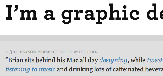
Simon Collison uses font pairing excellently on his site, choosing a strong sans-serif for main titles, and a simple Serif for the other, smaller headlines, as well as copy. This partnership expertly displays the message that the website is trying to say, in a way that each font individually could not express.

Size
As a general rule, designers like to set their body copy at the very least at 12px. Most, however, chose a larger size like 14px, which is even better for readability. Font-sizing is really quite easy to decide on for body copy, but it’s the titles that start to get complicated.
How big should your titles be? It depends. In my observation and creation of websites, I’ve come to the conclusion that a title should only be as big as it needs to be. This means that you should try out different sizes until you find one that is just big enough to draw the attention you want to it, but no bigger, unless huge text is what you’re going for, in which case go right on ahead.
Hierarchy
The nature of a title is big. It’s an important item on the page, so naturally it should be bigger, right? Yes and no. Yes, titles are generally bigger than other elements, but no, this is not the only way to draw attention to them. Color, weight, and placement are all equally important to establishing a clear visual hierarchy to your pages.
The key point to remember about visual hierarchy is that it’s all relative. Text on your site only has to stand out compared to the other text on your site. Take Wilson Miner’s site for example. His titles are quite small for how important they are, and are surprisingly close in size. However, his use of color distinguishes the most important title, and gives them more meaning.

The use of type is a very important tool to establishing visual hierarchy, be it through size, color, weight, or even placement.
Leading
Leading, or the space between lines of text, is an invaluable tool for readable text. Bad leading can ruin an otherwise stellar piece of copy, and good leading can make even the worst type look readable. Fortunately, it’s not that complicated to implement.
Using the CSS line-height property, you can easily assign space between your lines of copy. Generally speaking, for large blocks of text, 1.5 times the size of the text is a good size. Smaller text should have tighter leading, and huge text should have a lot. It’s not that complicated, really.
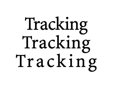
Tracking
Tracking is the space between characters in text. I’ll admit, this one’s a bit of a grey area when it comes to “Practical Typography,” in that CSS doesn’t give us huge control over it. Usually, you won’t have to worry about it for small text, it’s only for titles that it becomes an issue. Generally speaking, adding letter-spacing: 1px; or letter-spacing: 2px; to your CSS should be enough space between the letters.
Another place it would be beneficial to add tracking to is small-caps. Here it’s generally considered good practice to add an extra pixel or two between the characters, as they naturally appear larger.
Color
While not strictly-speaking typography, color is a very important part of every website’s type. I’m not talking about color schemes, but rather about the contrast needed to insure readability on your site. Black text on a white background (or light background) is widely considered to be the most readable color for text.
I’m not saying you should go and set everything to black-on-white, just that when you’re designing, you should be aware of the contrast of your text. It could come back to bite you if you’re not careful.

The Grid
In my opinion, use of the grid is the most important idea for practical typography on the web. You can have great fonts, spacing, and colors, but if you don’t have a good layout, you may as well be using comic sans.
Using a grid when you’re designing with type provides a clear balance and geometric structure to your design. It isn’t the magic fix to a bad design, but if you design with a grid from the start, you can be sure that at the very least, your layout will be solid.
So what does a grid have to do with typography? Put simply: everything. The grid embodies all the fundamental ideals of typography. It’s geometric, consistent, usable, and above all: beautiful.
Setting your text with a grid is a key way of establishing visual hierarchy, and it’s a great indicator of how large (or small) your text should be.

Standing Out
As I said before, if you’re typography is readable, then you’re already ahead of 50% of the competition, so what about the other half? If you’ve made it this far, then together we leave the clear, consistent rules of readability and enter the murky and mysterious world of being unique.
Fonts
You want your website to stand out? Step 1. Employ some unique typography. Presumably for you this means to use some unique fonts. But what makes a unique font? For me, it’s not one that isn’t used often, but one that has a message or feeling not employed by other faces.
Choosing a unique font is really about the feeling. Does this font feel different? Or does it just look different? When choosing typefaces for any projects, you should always be considering the feeling of the design. As this is totally a personal opinion, I can’t help you find a unique typeface. What I can do is show an example of unique fonts.
The Design Cubicle has a very unique logo and design. It’s strong yet classy, attention-grabbing yet subtle. When I look at its design, the feeling of class just oozes out of the site. It says, “I know what I’m doing.”

Be Unorthodox
How many websites do you know whose logo is as big as the content? What about an ultra-thin title? Unlike my last point, being unorthodox is about seeing what others are doing, and then doing the opposite.
The folks at Savvy Belfast are smart. They noticed the cramped look of most websites, and decided to replace all that meaningless copy with one statement.

Even if you visit their site for only a moment, you can’t help but remember their name.
Match Your Design
Typography is not it’s own thing. It’s a part of web design just like any other. Type is important, yes, but you shouldn’t forget that is is just part of what makes a web design great. You should design your type with the rest of your design in mind.
If you use a highly elaborate background texture, then maybe a nice serif would be good for your titles.
My point here is simple: Don’t forget the context. Design is a huge field, and today I’m just talking about one part of it. For a successful website design, all the parts have to mesh together successful. That’s the goal: to craft the experience that somebody will have on your website. You can’t do that with just type, or just color, or even just content!

Emotional Type
So much of an experience is defined by how you feel: happy, sad, amused, angry, blah blah blah. Humans have a wide range of emotions, and as designers, it’s our job to evoke these emotions with our designs.
Of all the things I’ve talked about today, this is by far the most abstract, and it’s a little hard to explain. Instead of trying to explain this to you, let me show you.
When I first visited Solid Giant, I smiled. I smiled the next time I saw it, and even the next time. Immediately I felt a kinship towards the design. That big, fuzzy “G” is just too adorable to forget!

Quite frankly, I think it’s genius.
There’s no way to teach emotional design, it’s something you have to experience, and then play with in your own designs.
Practical Typography
Well, you’ve reached the end of the post. I hope that at the very least you’ve learned something, but if not, that’s fine too. If there’s one think I want to leave you with after reading this, it’s that above all: be readable. The rest will follow.
What do you think the most important part of typography on the web is? Leave your opinion in the comments!